Use our online designer studio to create your own personalised flyers, business cards, greeting cards and more.
Order NowWhen it comes to professional printing and advice on your business marketing, we are the team to call! You can call us direct on 04 568 8773 or fill in our quote form.
Request a Quote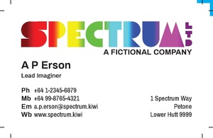
So you’ve received a proof of your brand new business card or flyer design from us and are not quite sure how it’s meant to look when the job is done. We don’t blame you if you can get confused by the way things look from a pdf supplied to you from from a designer or an online design software like our own Web to Print Design Studio. Sometimes we get confused too when a designer uses some obscure settings or markings on the print files. So here’s a quick guide of what to expect when you get a proof from Copy Express.
This means if you print a business card proof for example and don’t alter the scale of it, the size you see on the page is the size it will be. It doesn’t matter if it’s an address label or a big banner, we set things up so the design is at the true size. Sometimes due to practical limitations we will supply a half or quarter sized version, but we will make note of that in its file name.
If there seems to be a lot of white space in your proof it’s because there is white space in the design, and we show where we trim the design by special printing marks. (See below for more information about trim marks.) Sometimes it’s a practical limitation of the job, ie booklets are made up in steps of four pages and if your page count isn’t in four we have to add blank pages. Other times we are limited to what we can do in the space and end up with some of it ‘going spare.’ If you’re unsure if there’s unused space then give us a call and we will confirm it if we haven’t already said so in the email the proof was attached too.
Most proofs are what we call ‘print masters’ as in it’s the same file we use to print your work. If the file gets to big to send then we may send you a e-proof, where the image quality is reduced to save space and allow it to be attached to a email. As we are printing company first and foremost the designs we create are for printing with, and contain a lot of information that printers need. If you want to use it on your website we then have to strip out that information to ensure the best on screen quality for the smallest file size. That’s why we have a Online Ready PDF product on our Web to Print service.
This can get a little confusing at times when it comes to folded items, as the way the sheets are laid out aren’t necessarily how they are seen when you get the folded item in your hand. We can supply physical samples to make that easier, or scan it in reading order and email that too you. Our downloadable templates are also setup to show you the order how things in the way they are read.
Our printer is quite skilled at dealing with multi page documents and laying them out correctly to make high quality booklets that allow for all the quirks of printing on paper. To keep things easier for you to understand and for our system to deal with, we will always supply your proofs in a logical reading order. The exception to this is when we come to covers. In some cases it’s supplied as separate document and may be a single flat sheet if we have to allow for the width of the spine
Printing
marks are, well, marks we need to have when we print your work. These
are placed outside of the the finished document and are removed when we
trim the items down to their finished size. Here at Copy Express we keep
the print marks to a minimum as most of the information needed to do
the job is stored with the design in our system:
Crop/Trim Marks
These
are the small pairs of lines at each corner of the file, as seen in the
image above. These marks show where we will cut paper/card of the
design to final version of it. You will see any colour or background art
going past where we will cut as we need to trim off the ‘bleed’ to make
sure that you have the best looking printing you can have.
Alignment CornersYou
might see a blue or pink ‘L’ shape in the top corner of our template or
proofs. These are alignment marks to help show how the front and back
of design match up. The blue one is on the front, pink is on the back,
and both match up on the same corner of the printed sheet.
Dotted LinesIf
a document is being folded or creased in any way, then often we will
mark it with dotted lines to show where that should happen. This helps
us make sure that the equipment we use to do the work is properly set.
Dashed LinesIf
there is perforation in the design, for example NCR books or gift
vouchers, we will mark were that perforation will be with a dashed line
outside edge like fold lines. Sometimes though to make things clearer we
will put the line in the printing area of the design and remove it
before we print.
Other marks you may see include:
Double ‘Crop’ MarksIf
you see two pairs of the Crop marks on each corner of a proof, this
means the designer has put on both the crop and bleed marks. Bleed marks
show where the background art finishes and is needed if there extra
finishing work needed like foiling or Spot UV coating.Colour BarsYou
may see a line of square on one side of the design going through shades
of grey from black to white and on the other side a line of square of
different colours. These colour bars are needed for some types of
printing to help the person running the printers check that the colour
and shading stays consistent throughout the run. Modern digital printers
don’t need it as they self check the printing quality during the
process using inbuilt scanners.
Registration MarksIf
you see on the file what looks like a scope crosshair (a set of circles
with vertical and horizontal lines through it) these are registration
marks. These are used when the printer has to run the printing through
their printer several times to complete the job. As no two runs of a
print are ever quite the same, the registration marks allow the printer
to make sure that everything is correctly aligned. When it isn’t you get
that colour ghosting effect that make things hard to read.
Other Marks like text or barcodesYou
may find barcodes or text that is used to keep job information as part
of the page as most printing companies are largely automated and these
are used to drive the machines that do the printing and finishing. Again
these are trimmed off or hiddened when we print and finish your work.
So this is a quick rundown of what you should expect when you get proofs from Copy Express, or other designers and printers. If you are confused by it or want more information then please do give us a call or email and we will be happy to answer all of your questions.
 41A Bay St, Petone