Use our online designer studio to create your own personalised flyers, business cards, greeting cards and more.
Order NowWhen it comes to professional printing and advice on your business marketing, we are the team to call! You can call us direct on 04 568 8773 or fill in our quote form.
Request a Quote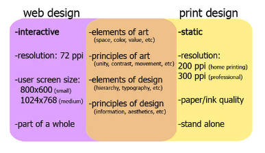
It’s been a growing trend these days that designers are only creating for (or only being trained how to design for) electronic media, such as websites and emails. The problem is their clients then hand us those same files and are unhappy when what we print doesn’t look good. There are several different things that can cause this problem, we will cover them and show you how to fix them without making extra work for yourself.
This is the biggest one of the lot. Quite often we will be given a powerpoint presentation and be asked to print it. The problem is that screens use to be 4×3 ratio and now have a 14×9 or 16×9 ratio. Printed pages on the other hand have a ratio a/b = √2 and specialty things like banners, business cards and signage work on other ratios. Generally speaking for simple fixes we just scale the supplied images down to best fit the printed page as in most cases with a white margin around the outside. If you need to fill the page then printers will cut to size but you will end up paying for the custom page size. We at Copy Express will do our best to accommodate your custom sizing at minimal costs.
The simple fact is that screens still operate at far lower resolutions than printed pages, about about one 1/9th number dots in fact. If you design for the screen first, then the file is printed on the page the dots are going to be much more obvious to the viewer and make it look of poorer quality. A better way is to work with this most detail you can and when it’s time to generate the screen documents, most image/design software will let you drop the dpi in the saved file for screen use, then you can save a second version with the high detail you need for print.
Following on from the Dots Per Inch point, for a computer screen you just don’t need so much detail for it to be useable, detail that will make the files so much larger to store send. Programs like Adobe’s inDesign and even Microsoft Publisher have the ability to save pdf in different quality levels to let you trade it off for file size. If you design for print first and save that as one version then it’s just a few option toggles to save a second version dropping the quality a bit to give you a much smaller file. These same features allow you to setup the bleeds and printing marks a printer requires to be able to print the documents, and have them all turned off when generating the pdf to be used on the web.
One of the most common problems we’ve had printing files designed for the screen, is that they say we’ve printed them darker. It’s not the case, in fact our print systems try to match the colours in the file as accurately as it can. What is happening is that the eye is seeing it as light reflected off the image, instead of being projected by the image, so there is going to be less light reaching the eye so it will look darker. It also doesn’t help that a lot of people do have their screens overly bright so what they see isn’t actually how the file looks to the computer/printer. If you consider this to be a problem, just lighten the problem areas by 5-10% and that should minimise the issue.
Most modern print systems can handle mixed colour profiles with little issue. However there are a couple of things to be wary of. When colours are converted from RGB to CMYK, there’s going to be a slight drift in the colours. It can’t be helped as there is a limit of how colours can be rendered by a printer. If it’s going to be a very big issue, then convert your RGB images to CMYK before generating a printing PDF. Spot colours can also be a problem depending on what is being used to print it. Our print systems are able to deal with it normally but depending on the nature of the spot colour, it could become ‘invisible’ to a printer even though you can see it in the PDF. If you think there might be problems then give your printer a call and they can guide you on how to deal it.
Printing
equipment, while a lot smarter than it use to be, can be easily
confused by complex multi layer designs. Especially if there is special
effects beyond simple stuff like transparency and shadowing. When faced
with layers it can’t untangle, it will look at them in the order the
document has them stacked on the page and make the best guess it can. So
sometimes graphics and text might vanish or become distorted because
another bit of artwork over it has confused the printer. While at Copy
Express we will try and catch these problems before we print, we don’t
always know how the finished look should be so can miss it. If you have a
complex multilayer design, and the printing company has a problem with
it, try when generating the PDF: flattening the layers, removing the
ability to edit the pdf (which helps greatly reducing the file size), or
saving as a series of 300dpi tiffs or pngs then using a program like
Adobe Acrobat DC to combine and convert the graphics into a new PDF.
And
naturally this article has only been skimming the surface of what you
can do to make sure that anything you design will look great on both a
screen and on a page. If you want to learn more then give a call at Copy
Express and we will be glad to help you out with it.
 41A Bay St, Petone