You may or may not have wondered how printers make all the colours that you can see when they may only use 4 or so colours to do it. You might also have been wondering how you can have one colour on a screen, say a purple, and it looks bluish on the print out from your home printer but it has a slightly more red note when we print it at Copy Express. This is the wonderful world of colour gamut and printing technologies. In this article I’m going to give you a quick run down of the different systems used and why it can make things look slightly different with every method used.
The first thing to understand that all system, no matter if it’s a big screen tv, your cellphone, a cheap inkjet home printer or a multi ton industrial plate press, render the colours you see by using a grid made up of dots of their primary colours to make each dot of colour you see. The degree of how well they can use those primary colours to make each unique shade is known as the colour gamut. Screens of tvs and phones are much more able to render colour than printing because they can have up to 256 levels of red, green and blue, giving you quite a good range of colour. Print is limited a dots of up to nine pre made colours that are so fine that your eye blends them together to make a new one from them. This is where photo printing is separated from commercial printing because commercial printers are generally limited to just four colours, while photo printers used up to nine and will print two or more colours on the same dot to give more shades. The downside is the more colours the more cost per square meter of printing so this is why even now commerical stick to just the four to which covers 95% of peoples printing needs. If you want to find out more on colour gamut, this article in wikipedia goes into far more technical detail.
As we are a commercial printing company, we are now going to talk about how we apply our primary colour to a printed page and how that can effect the look of your printing. Depending on the type of equipment used, it can be solid/discrete process, liquid/overlay process, or spot.
Process Colours
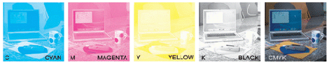
Process colours work by breaking down all colours into a mix of cyan, magenta, yellow and black then printing each colour separately onto the page that when the four are combined they make up the full colour image. (see the illustration below) How the four colours are laid onto the page effect how the colours are rendered.
Solid process
With ‘dry’ systems like the toner based printers we use at Copy Express, you can’t mix the colours over each other as the pigment is opaque so you can’t see any colour under the top most layer. When that method is used, you make the colour up by using very fine dots and let the eye blend it to make the colour. It makes it fast and flexible to print but with the limit that many colours will ‘drift’ / change slightly as the machine tries to make the closest match. They do try to get around it by adding more base colour to the equipement but every extra colour you add extra cost and production time. This is why any form of volume printing tends to stick to the four colours as the ‘good enough’ solution that still gives you great prints most times.
Liquid process
With ‘wet’ systems like the inkjet wide format printer we use at Copy Express, those colours can be mixed on top of another by varying the size of dots used to overlap and blend it. However depending on the equipment being used they still might use the same way of mixing colours as the solid process for keep the costs low, minimise the risk of colours mixing while wet, and the production speed high. Normally you would only see sort of process where the aim if for greater range of colours is vital, such as high end art books, or premium marketing material.
Spot Colours
Sometimes you need a very specific colour that is consistent throughout the entire production and can not be easily or consistently made by mixing primaries, instance the Cadbury’s Chocolate purple found on their wrappers. In this case they have a speciality ink made up to be that shade and print that as an separate additional colour on top of the normal set of four. In other situations where normal printing methods are limited, like No Carbon Required invoice books, having the ability to pick out colours in a way that doesn’t effect the paper itself, is extremely useful. You can also do some neat effects with it, like adding metallic inks or a varnish that then gives a embossing effect. Naturally this is more expensive than the rest as it’ extra step and extra materials needed to do the job. Also with many print systems spot colours become invisible because it’s not made up of the primary colours and therefore gets missed, making your print look strange.
Now you might be thinking after reading all of this, ‘do I really need to know this?’ In truth most the time no. However when we talk to you about spot or process colour, or why what you designed on screen doesn’t look the same in print, but reading this you may understand it a bit easier.
 41A Bay St, Petone