Staying Big while Going Small – The art of smart longer marketing material design
Now in this age of the digital marketing material, it is easier than ever to put every bit of information in your flyer or brochure as it costs no more to electronically send a 200 page document as it does to send a 20 page one. But we don’t completely live in a digital world (yet) – we are still contrained by the physical. Not only does every page cost in terms of design (whether you are digital or print) but many brochures are still delivered first as printed material and second as digital. So it’s good practice to design for print first. And that massive time of information might actually be hurting your marketing image instead of helping it. So we are going talk about what you have to think about when designing for items that are going to be longer than a simple flyer.
Sooner or later every business has to design for multi page material. It could be a product brochure, a catalog, reference manual, or any other item that’s longer than a single double sided sheet of paper. Naturally people just keep in the putting all the information they can in there; not thinking about the cost of printing, assembling, shipping and storing that finished document. I’m going to talk about the simple tricks you can use to make sure your clients have all the information need to have while minimizing the costs to you.
The 5/15/60 Rule still applies
I’ve talked about my 5/15/60 rule in design for marketing, and the principle still applies here too. When people pick up a longer document, general it’s because they want to find out information they need quickly, and you have to do everything to help them with that. For a smaller brochure, it you might want to put the key information on that first page with a ‘for more see’ with the heading or page number, or even a link to the appropriate page on your company website. In longer ones a good table of contents page is a must, and might want to include a single paragraph overview of the section/chapter at the start of it. I’ve assembled a lot of technically focused brochures over the years, and the good ones have at least the contents pages. Any word processor or desktop publishing program worth its’ salt will have the tools for content pages and indexes built in, so if you use headings and sections breaks, the software can generate both with just a couple of clicks of the mouse.
Think about who the material is for
The biggest offenders for this is product information brochures. All too often people in a industry will load it full of technical information and jargon that they feel is very important but in the process goes over the heads of the very ‘joe public’ customers who have no knowledge or interest in such arcane matters. If are targeting a customer who has to know all the technical information to make an informed buying decision then include it, otherwise keep it to the back of the document, as a separate insert you can include for those technical customers, or a link to your website on where to find it. The goal of the document you are making is to inform and encourage your prospective customers to find out more. You don’t want to scare them off with a wall of jargon and assumptions of knowledge.
Does the content change on a regular basis or be customised for different clients
If you are such a situation you may not want the ‘constant’ expense of having to print off complete new documents with every little change. A common example of this is restaurants menus, they will change their menus to meet seasonal changes or to better match their diners preferences. A smart solution is to break down the range of information into simpler stand alone items and then provide it as a pack not as complete book. It might be a branded document folder with loose flyer style information sheets, or in the restaurant case a folder with pockets that you can slip in new sheets as the contents are updated. This reduces your overall costs as you only have to spend time updating that changed info sheets and pay for printing only that. Sure there’s a little more labor cost to do the assembly work but overall it will be saving time and money.
Your flyers can be your brochures too
Following on from the previous point, don’t reinvent the wheel if you don’t have to. Sometimes all you are doing is just combining your various flyers into a single package. Now you can just pack those lose flyers into a branded presentation folder, and maybe include one or two pages of covering material and you are done. If you want a bound booklet style of document, as long as everything follows the same consistent design, thanks to using a design bible, then you can just merge them all together, create the required indexing information and covering information, and you are ready to print. This is where planning your marketing before hand saves you time and effort later on.
Chose the right type of document size and binding to match the materials intended lifespan
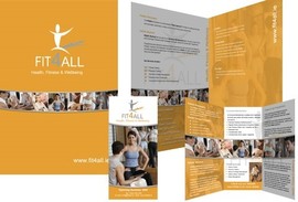
The problem with a multipage marketing item is the more complex the binding process the more expensive it is. Printing the sheets of paper is quite cheap, it’s every step of labour after that costs. One of my clients needed a product cataloge used for trade shows and originally it would have become a 12 page A5 booklet, so that’s 6 sides of printing being cut down to three sheets that then have to be folded and stapled. With careful planning on our part we turned it into a A3 that folds into A4 then into a DL, so 2 sides of printing 1 set of cuts and two sets of folds. By doing this they saved about half the costs and had the same information that was easier to store and give out. For items that have a longer life and will be constantly be used, comb or perfect binding has a much longer lifespan and are a must for documents over 80 pages.
Don’t be afraid to send people to your website
I know this coming from a printing company might sound strange, but it’s a practical solution to dealing with keeping marketing material to a manageable size. On the website you can go to all the technical information you like, add videos of the products in use, include extra testimonials from people who use it, and so on. The idea with your physical marketing material is to make people want to buy your product or at least want to find out more, the 60 seconds of the 5/15/60 rule, you can use the website to do help confirm to the customer that they made the right choice. It is also a smart idea that if people find you via your website first that there are downloadable versions of that material for them to grab, read and even print off themselves.
Of course what I have listed here is just a brief outline of what to think about when creating a multipage marketing item. There’s a lot of smaller tricks and traps to be aware of before attempting it and this is where talking to Copy Express can be very useful. We’ve designed and printed all kinds of marketing items and we can help you to find the right solution to your needs. All you need to do is email or give us a call and we will be happy to help you.


