Use our online designer studio to create your own personalised flyers, business cards, greeting cards and more.
Order NowWhen it comes to professional printing and advice on your business marketing, we are the team to call! You can call us direct on 04 568 8773 or fill in our quote form.
Request a Quote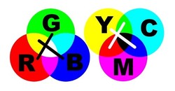
The Primary Colours, the three colours you use to make every other colour you see. The trouble is, which three primary colours do you mean. You may have been taught in science class that there are only 3 primary colours Red, Green and Blue, but in art class you may have been taught that the three primary colours are Cyan, Magenta and Yellow. Well in fact they are both correct and depending on which set you use can affect how your printing looks.
TV’s, computer screens, cellphones, pretty much anything that has movement, relies on projected light. The three most basic colours of projected light are Red, Green and Blue. It is what I like to call an additive system, the more of a colour you add the stronger it gets, and when you mix them the closer to white they become. The printed or painted page relies on light reflecting off it, losing part of it thereby changing its’ colour to Cyan, Magenta and Yellow. I call it a subtractive because you have to reduce the amount of the primaries to make it lighter and whiter (on white paper), and when you mix colour they always become darker than their primaries.
So what does it matter which primaries you use to make a colour, it should work out the same right?. Sadly no, it doesn’t, in fact there is a whole world of tiny little issues that can spring up from mixing RGB with CYMK when it comes to printing.
The first one is just converting between each type of primary sets can be tricky. Take the colour purple, in RGB it’s 50% red and 50% blue, but in CYMK it’s 100% magenta mixed with 50% black. If the purple is closer to violet then the RGB becomes less red and more blue, but in CYMK the black is replaced by almost as much cyan. That requires a bit of math to change the ratios around, and that’s for a very obvious secondary colour, the calculations to work out the conversion between two ways of making up a pale tan can be a bit of a guess at best. Now the software built in to our printers are designed with a huge set of rules on how to do the conversion no matter the source file and the material it works on to get the print to come out as expected but there are some limitations we can’t beat.
You will have noticed that when I talk about printing there’s alway a K with the CMY. The K stands for blacK (since blue got the B) and is a separate primary colour. While we could mix CMY to make a black, it’s wasteful, especially as black is used so much in printing that it makes more sense to have a separate black primary and use that instead. The problem arises is that when a RGB almost black is used in a design (like R5%,G5%B5%) the printer ends up using all four of the colour to make it, resulting in a ‘rich’ black that noticeably different from the true black. Again our systems do have a large set of rules for dealing with it but sometimes it doesn’t quite work and you end up with the contrasts of the two blacks against each other and showing up differently when the light strikes it at certain angles.
When printing offset using liquid inks, there is a problem that if there is too much in on the page, it will oversaturate the paper causing distortions, blurred images, and transferring of the excess on to other pages causing ‘ghosting’. As such offset print has rules about how much coverage you can use, and unfortunately RGB images can cause oversaturation by the nature of how the printer has to convert the colours to CMYK. Now they do use specialist software to convert things over to the correct densities, but it can only do so much and a job can be rejected because there was an RGB image that over inked the page. With our toner based systems it’s not as much of an issue because of the way the colour are put down, but our systems will somes ‘drift’ a colour to a slightly different shade because of how it has to figure out the colour conversion.
Sometimes there are colours that are almost impossible to create 100% accurately by using CMYK, the purple of the Cadburys chocolate wrappers being one, so there always going to be some colour variation. In fact for those special colours, they often go back to using specially mixed inks to guarantee that the colour will come out correctly. For small volume runs, it’s not economic to mix up speciality inks so you either have to accept the risk of some colour drift, or change colour to something can be more reliably printed.
Finally, while screen resolutions are nowhere near the resolutions that printers work at, they are much more advanced in colour reproduction. All visual technology has a colour gamut, or a range of colour that it can produce accurately. Screens have a much larger one by having the ability to finely adjust how intense each of the primary colours are. They have 3 primaries each with 256 possible values giving a total range of 16,777,216 possible colours (not that any screen is capable of showing that many.) Print on the other hand can only adjust the number of dots used for each primary used to make each visible dot. As most combinations of dots are replicate other combinations at the moment you get about 20-40,000 possible colours with most industrial printers. So when you get a colour that printer can not find in it’s palet range, you will get the closest one there is.
Now if this all sounds like doom and gloom about colour reproduction, it isn’t. 99% of the jobs we deal with here at Copy Express never have any colour issues, or 100% colour accuracy isn’t needed. If you do need to make sure that the colours are absolutely correct, then we are more than happy to print out a sample for your inspection and to offer suggestions on how to get the colours looking the way you want. We want you to be happy with your print so let us help you get exactly what you want with your next printing job with us.
 41A Bay St, Petone