Quick Guide to Designing for Wide Format
So you want to design a big poster or banner. We all know that most computer programs like Office or Publisher have problems dealing with something as big as an A1 sheet of paper. There’s also the issue that you are designing for something that is meant to be seen at a distance so the rules for good design are different. How much information should you put into a poster? What colour combinations work for easy reading? Are there good and bad font choices for posters? How can you design it without it getting so big that it slows your computer to a crawl or it’s too big to sent to be printed? I will answer all of these questions and more so read on.
- The first trick to make things simpler for you is work with a scaled down version of the page. If you want to print a A1 then a designing everything on A4 and remembering that when it’s printed it will be 4 times the size. The same thing can be done with banners, so if you need a banner 850mm x 2010mm in size then set your page size to 212.5mm x 502.5mm and your computer will have a much easier time dealing with it. You can make it a greater multiplier if you want if you want to make the math simple but the key thing is to keep the ratio of the width to the length the same.
- Sizes for posters are very simple, you either pick a ‘A’ size for posters, or you pick the short edge width to match the width of the media you are printing on for banners. The length of the banner is generally pretty flexible since it’s ‘paper’ supplied in rolls 10’s of metres long. At Copy Express we set up the print run to match the length you need and trim to size.
- White is your bank account’s friend. When printing large format work, many business (including Copy Express) charge based on ink coverage. More of the page covered in colours, especially dark ones, the more you will be charged. Look at making use of white space or very light colours for backgrounds.
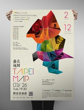
- Choosing your colours is pretty simple. What you want is the maximum clarity for easy comprehension so you go for naturally contrasting colours. If you have a light background you chose a dark foreground colour, or light foreground if you want a dark background. Which colours you pick is up to you, just pick one colour for the base/background and chose your complimentary colours to stand out from it..
- When you can, use vector art instead of bitmap. Unless the original artwork has been created to be 1:1 on your banner or poster, you will be most likely be scaling the artwork up to fit the design. While you can scale up bitmap (gif, jpg, png, bmp, etc) artwork a bit, the bigger you stretch it the more blocky/pixelated it gets. Vector artwork (eps, wmf, svg) doesn’t have that problem as the artwork is made by a series of mathematical calculations, not dots, so you can stretch or shrink the artwork as much as you like and they will always look the same.
- How big should the fonts be? That all depends on how close you expect people need to be to read it. If it’s a poster that is going to be on a busy street, then the bigger the text the faster and more likely they are going to read it as they walk past it. If it’s an informat graphic that you expect people are going to be close up then you can go quite small to fit all the information in. If in doubt, minimise the amount of text and maximise the size of the text.
- Posters are more sensitive about the fonts you use than normal printing because most posters and banners are being used in situations where you have very limited time frame to get the information across to people before they have moved on. I’ve talked about making font choices in several articles in this blog. I’ve found the same rules you apply for business card font choices work on designing poster and banners.
- If you are planning to make use of drop/pull up banners or larger posters, think about where they are going to be used. Most people don’t look above 1.8 metres or below 1m when giving things a passing glance, so make sure that you put the attention grabbing information or artwork where that it will fall inside of that band. Secondary details can go above and below that but no higher than 2.25m or lower than 0.5m as people don’t like straining their necks to read things. Also think about what might be in front of the poster.
If there will be a table in front, then don’t put anything critical below waist height.
The final most important tip is to talk to us at Copy Express. There’s nothing better than a fresh pair of eyes to look at a design. We can spot any issues and offer you ways of helping you get the most from your investment.
 41A Bay St, Petone