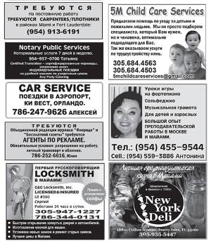
Marketing in Miniature
I’ve said it before and I’ll say it again. No piece of paper or product should ever leave your business without your details on it. Why? Because you want people to remember you were the supplier when they reordered a product or when a friend or colleague asks where something comes from. The challenge is how do you get your details in there without being obnoxious or wasting space. Let me show you the ways.
The old saying ‘less is more’ isn’t quite true when you deal with design for small spaces. What it really should be is ‘doing more with less.’ The basic trick of good design is to know what is vital to get your message across and keep your focus on that. So what do you need to think about for design in tiny spaces.
- How complex is your logo? If you look at all the big companies their logos are very simple and clean. This give them the advantage that no matter how big or small they make them, what material they are printed on, how they are used, they always remain recognisable. If your logo is too ‘busy’ you may want to invest some time and money with a designer to come up with versions made for smaller sizes. Having a single colour version is good too as it is handy for situations like screen-printing or stitching on to clothing.
- Do you need all your contact details? The minimum you need to have theses days is your phone number and email address, maybe your website address if you have one (but if you have a proper domained email (e.g., print@copyexpress.co.nz ) then most people will work out your web address from that). Practically no one uses faxes and post today because they want immediate response to their questions – although your physical address can be vital if you are in retail. You can also chose to leave out naming what contact details are; most people can workout that a ‘02’ number is a mobile phone number, 0800 means toll-free, ‘someone@somewhere.co.nz’ is an email address, and so on.
- Keep the colour choices simple. The more you have to fit into a space, the clearer it has to be. Forget about photographic images or colour gradients for a background, a solid block of colour makes it easier to read. With text it should be a natural contrast colour to the background, white on a dark green or dark blue on a yellow background. The less colour the better, as too many colours in a design make it look crowded. If you have to use a complex background, then use the contrast and brightness tools found in every art, desktop publishing, and office application. Either darken and reduce the contrast to prevent it overwhelming your text, or lighten it and reduce the contrast to make it a watermark.
- Don’t use thin/light fonts for important information. While it lets you fit more into the space, below 9 point in size a lot of people find it hard to read, especially if it’s a light colour on dark background. Avoid what I call headline fonts, the arty type designed to look pretty, they get very ‘messy’ bellow 18 point making it hard to read. While typefaces like Arial, Times New Roman, Sans, etc are ‘boring’ they were designed to be extremely readable at any size so make use of that for getting your information across.
- If you want to include photographic images you can, just allow for them to become quite small when scaled down to fit a classified ad for instance. In many cases it’s better to crop the image down so that it is focused on the key selling point, a key in a lock is more effective than showing a range of security products when you are a locksmith. Pick images that have good strong contrast, especially if it’s going to be printed in ‘black-and-white’. A pearl necklace on a black background will stand out better than if it was on a pale pink or skin tone one.
This is just a starting point. There is a lot of tricks and smart planning to get the most of a few square centimetres of space. Here at Copy Express we know a tonne of them and we are happy to share them with you. Just book a meeting, send us an email, or give us a phone call, and we can sort out the solution to your Marketing in Miniature.


