
Use our online designer studio to create your own personalised flyers, business cards, greeting cards and more.
Order NowWhen it comes to professional printing and advice on your business marketing, we are the team to call! You can call us direct on 04 568 8773 or fill in our quote form.
Request a Quote
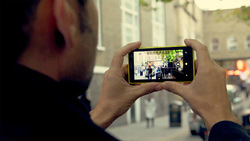
These days everyone has a cellphone on them that can take pretty good photos that you can use for marketing. The trick is not taking “pretty good,” you want to take “great” photos that will wow people when they see it. So this article is all about a few simple rules and tricks you can use to make sure you can get the best photos you can get.
Most people use their cellphone to take photos to send to their friends. As such they want to keep the file size small as not to use up their mobile data, by using lower quality settings. For print you want as big as you can make it and with as much detail, no matter how big it gets. Every phone does it slightly differently but you want the resolution/size to be the biggest megapixel (m) you can get and set the quality to fine or best. If your phone offers a wide screen version, don’t use it as it just trims off the top and bottom of what it sees giving you less to print with later on.
A lot of people these days like using all the fancy image effects or filters to make their photos pretty. For print it works against you because it’s hard to undo those effects when trying to make it look good. If you do want to have a special look to the image in the finished marketing material, it’s easier to add it later when it’s being put to the design. Turning on image stabilization is a great idea as it reduces the risk of blurring or ghosting of the image from your hand movements as you hold the phone. If your phone doesn’t support image stabilization, then rest on a flat surface leaning against something. It is easier to correct for the image being slightly distorted than to deblur a fuzzy photo.
Unless you have the light behind or above you, the odds are your subject will have shadows on it. Shadows in the wrong spot can ruin an otherwise excellent shot. Turning on the flash can generate a fill in light that can correct shadow problems. While it can wash out some colour on the shot that can be corrected later on with photo editing software. If you aren’t sure then take some photos with the flash, some without, and pick the ones that look the best.
There’s old rule of thumb from the days of film photography, out of 24 shots half will be not great, 6 will be okay, 3-4 will be good, and if you are lucky you will have 2 great shots. Now that everything is digital there is no reason not to take dozens of shots to make sure you get the the best you can. Many cellphone cameras have a best shot or burst mode where the camera takes multiple shots with a single button press allowing you to pick the best one.
Another old photography rule is the rules of thirds, where you divide the screen into a 3 by 3 grid and you place the point of interest on one of the divider lines or intersections to produce a visually pleasing shot. Many modern phones have a option where you can turn it on to guide your shot. For work you intend to use for marketing work I would add the rule of quarters. If you divide the screen into a grid 4 by 4 and make sure that what you want people focus on is fits within the four innermost squares as this will you plenty of room have full bleed artwork without things being chopped off.
It’s a modern syndrome that everyone takes photos in portrait mode. Most photos in marketing are used in landscape. Take the photo in the wrong orientation and you end up having to cut off large parts of the image and end up with less to work with. Take photos in both directions so you not only have the photos for what you need now but other marketing in the future too.
That’s all for now, but this isn’t the only article on photography we have on the Copy Express blog. Why not read these and if you want to learn more, why not contact us and we will be happy to help you out.