
Use our online designer studio to create your own personalised flyers, business cards, greeting cards and more.
Order NowWhen it comes to professional printing and advice on your business marketing, we are the team to call! You can call us direct on 04 568 8773 or fill in our quote form.
Request a Quote
I know that this an odd question but it’s an important one. Your company logo is a visual shorthand about you and your business. It’s there to describe you what you do, the nature of your business, what people expect to encounter when they deal with, and so on. Big companies spend millions of dollars to get this right, and must work because if I was to show you a hundred company logos at random you would be able to name most of them and describe what they do. More importantly if you didn’t know the company, you would still be able to guess what they do by they way the logo is designed. So does your logo represent you?
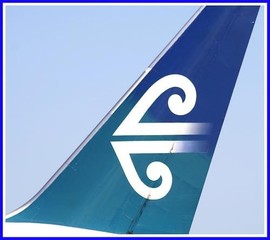
To understand how important logo design is I’m going to ‘take apart’ a well known logo and explain how they work so you can then apply the same logic to your own logo to see if that is true for your yours. In this case we’ll be looking at the Air New Zealand Logo, why it is styled like it is and what lessons you can learn for your own logo.
Everyone knows the shape of the logo, the double koru. The koru is the Māori symbol for an unfurling fern frond signifying new life, growth and strength and peace, and is a recurring theme in Māori art. Did you know that it has been used on the prows of the early Polynesian canoes that sailed the Pacific with its many islands, which has a strong correlation to the journies the airline makes around the Pacific. For people outside New Zealand who don’t know what a koru is the shape is often described as a cresting wave, so a company that is built about traveling the vast Pacific ocean, this works in their favour too. Also look at the fact that they use a horizontally mirrored version, meaning that we have an arrow head always pointing to the direction the plane is traveling so showing it moving forward even when parked on the airport runway. Leaning back also implies traveling as we ‘lean back when we move at speed’, this being replicated in the text of the name also has been sloped to lean back at different times. Finally with some of the planes having the horizontal bars of the logo fading out, you could say that you a looking up at the cloud trails that the planes leave behind in the sky.
Colours play a very important role for the logo design too. Starting with a teal and white colour combination (being a hangover from it’s Tasman Empire Airways Limited or TEAL days) that later morphed into a dark teal and sky blue colour representing the colours of the sea and sky. Later this was made a darker green to represent greenstone. Most recently this has moved over to a black and white combination. No matter what the colour combo, the logo is a single colour with thick bold lines, using white on a coloured or patterned background or black on a white background. this makes it clearly identifiable no matter how distant the plane might be or how small the logo is on a phone screen.
The fact that the logo has remained largely unchanged since it was first used in 1973 is a testament to a good clear design. Did you know that there is a ‘brisk trade in Air New Zealand memorabilia on trademe’ which proves how effective the logo is. So what have we learnt from examining the Air New Zealand logo, and how should it apply to your own.
Now I’m not saying your existing logo is wrong or that it needs to be redesigned but it wouldn’t hurt looking at it and seeing if it gives the right message to a potential client or customer. If you want an independent eye to have a look and offer how to make it more effective, then we at Copy Express can do that for you. If you need a redesign we can do that for you or coordinate with a independent designer on your behalf, doing most the ground work before handing it over to the more expensive specialist.