Use our online designer studio to create your own personalised flyers, business cards, greeting cards and more.
Order NowWhen it comes to professional printing and advice on your business marketing, we are the team to call! You can call us direct on 04 568 8773 or fill in our quote form.
Request a Quote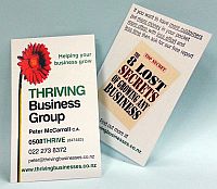
We print quite a few business cards, in a wide variety formats. I’ve seen a lot of cards that really sell the person and their business, I’ve seen a lot more that don’t. What people don’t seem to realise is that your business card is your first bit of marketing – the foot in the door. Do it right and you‘ll be remembered as someone to call on when they need you. Do it wrong and people will remember you as someone to avoid. I’ll be giving you a quick rundown on the dos and don’ts of business card design and how to make the most of that first bit of marketing collateral.
People will only spend a few seconds looking at a business card for the information they need and if they can’t find it they will move on to someone else. Cull all details that don’t directly contribute to your goal (which is usually getting people to contact you – do you really need to list more than one web site, your fax number or every social media account you’ve ever owned?) Exception to this rule is the items that make you stand out from your competitors, like awards. -Sometimes you can put this additional information on the back of the card because printing a second side adds only a small amount to the cost of the cards. If you are operating to a tight budget we can do a black only option if appropriate.
The point of the business card is to remind people on how to reach you. Make it clear and sort your contact details in the order on how to reach you. If you treat the card as your first bit of marketing think about how you would encourage people to contact you. Putting a promotional deal or an encouragement to give you their details is a great way of building up a database of clients and prospective ones for your future marketing.
Now that you’ve cleaned your details down to the essentials, this will give you the room to lay out the text clearer and larger. Not everyone has perfect vision, and if you have dark or busy backgrounds on the card, then making the type larger will make it easier to read. Some colour combinations are easier to see than others, especially if you are using a dark background and a light colour type. While the logo will have to stick to company colours, there’s no reason why you can’t use different shades to make it easier to read.
A good rule of thumb is to limit the fonts to no smaller than 8 point. If you are using thin or condensed fonts then no smaller than 10 point. Another rule is that a lot of fonts are designed for headlines only and become unreadable below 10 point. Look for fonts that support non-English characters (the macron vowles in Māori are a good ones to look for) because they will be designed for use at all sizes.
If you have logo or details too close to an edge of the card it will make it look off-centred which is visually unappealing. Printing involves many mechanical processes which can cause the artwork to shift slightly relative to the card edge over a run of cards. If text or artwork is too close to the edge it can be inadvertently cut off. Set the design’s margins to at least 3mm which avoid these problems and keep a safe margin at all times.
Thin borders near the edges of cards are almost impossible to get even on something as small as a business card. You are also using up space for a visual flourish that could be used for information to sell you. Just avoid them altogether if you can.
 41A Bay St, Petone