Use our online designer studio to create your own personalised flyers, business cards, greeting cards and more.
Order NowWhen it comes to professional printing and advice on your business marketing, we are the team to call! You can call us direct on 04 568 8773 or fill in our quote form.
Request a Quote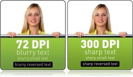
Being a printing company that works with a lot of small businesses, we get a lot of work done by people who are not professional designers. This is fair enough as this isn’t their job and so why should they need to learn all the complexities of digital design for print. that being said there are problems that come up again and again when we get peoples work in that can be easily avoided with a little knowledge. This time would like to give you the 6 common issues when getting graphics for printing.
The internet is a great source of graphics for people wanting to do basic design for themselves. Using image searching in Google or Bing will turn up hundreds for pictures on any subject you can think of. The problem is that the vast majority of pictures have been formatted for use on the internet making them completely unsuitable for print. There’s many reasons why that is, but in practical terms any graphics designed for the web are ¼ of the resolution you need for great looking printing. The simplest way of avoiding picking low resolution graphics is to do the following:
To work out how big an image can be before it starts looking blocky/pixelated divide the pixel measurements by 100 for its’ size in centimetres.
As a follow on from web graphics for printing is the problem when people send us scans for printing and they use too low a dpi rating. We’ve talked about DPI before so you can read that article to find out more. In simple terms if you are asking us to recreate something from a physical copy we will need as much detail as we can get to make an accurate copy. This is especially true when it comes to fine text, as found on a business cards, because often finding the correct fonts can be down to seeing how each individual characters are shaped. So when scanning things for us to use, set the scanner to as high as it will let you go.
This is the biggest problem we have when someone designs something, like a business card, in a photo editing program like Photoshop and sends the jpeg for us to print. JPEG is a format created by photographers for photos and one of the ways it saves space is by losing some of the information between blocks of pixels and averaging between them. In photograph that’s fine as works with the nature of the image so this blurring isn’t noticeable unless you are looking for it. Text on the other hand relies on strong colour changes on the edges of the characters to be legible, which gets mangled by the blurring process and looks horrible in print. A better solution is to save as a PDF so the text is kept as smooth as possible, or if your program doesn’t support PDFs, save it as a PNG which doesn’t blur edges unless you tell it to even though the file will end up bigger.
When you take photos, they often come out looking less natural than what you see. They are too bright or dark, looks overly hard or the colours look muddy. These can cause problems when printing as printers have a more limited range of colours to work from a computer screen, meaning that printers often can make things look even worse as they workout how to make the best of the photo. This is a problem that happens to everyone including professional photographers, so there are solutions to it. Every photo editing software comes with tools like auto image correct or colour correct, where it looks at the image and from the data the camera includes with the images tries to make the colours as natural as it can. It’s not perfect so there can still be some issues afterwards but most software come with more tools to allow you fine tune this by hand. If you want to learn how to do it, the internet has hundreds of tutorials and videos showing you how to do it.
This is a big one for us. All modern computer systems and most computer programs have the ability to save in PDF. If they don’t, there are plenty of free solutions that let you get around the problem. I’ve talked about these before so in a nutshell saving your design in PDF will give you the best chance of having the high quality you want in the finished printed item. PDF drivers work out how to best store everything in the highest quality it can without making the files to big to use. We recommend that if you have the option to save in PDF then do so along with the file format you want use which will give you the best prints in the end.
This one is for the professional designers out there. Often we get designs where there is graphic laid over a graphic which is laid over a graphic. Now depending on the type of technology being used to print the file, this can cause oversaturation of colours where these layers overlap. Oversaturation with liquid inks will result in damage to the paper and visible rippling. On a dry print system like laser printers the over saturation will can cause colour/tone shifts. Because of this you may find your job rejected by the printing company because they can’t guarantee the quality. There’s not an easily solution for this one as each case is unique but when we do find this problem we will work with you to find the simplest solution for everyone.
These have been the six common most problems we get with graphics and the solutions to help you avoid them in the future. Please read the other articles in this blog to find out more dealing with graphics and we at Copy Express are always ready to help you if you have questions on this or any other printing matter.
 41A Bay St, Petone